Widget Overview
Zip Widgets (North America)
Integration Guide for Zip widgets
Overview
Zip widgets inform customers of what Zip is and how to use it. The Zip widgets are designed to integrate well with a wide variety of online stores on desktop and in mobile web. By inheriting the font face, alignment, and color palette of your online store, while allowing for further style edits, the Zip Widget can seamlessly integrate with your site.
Zip has two types of widgets:
Zip Widget
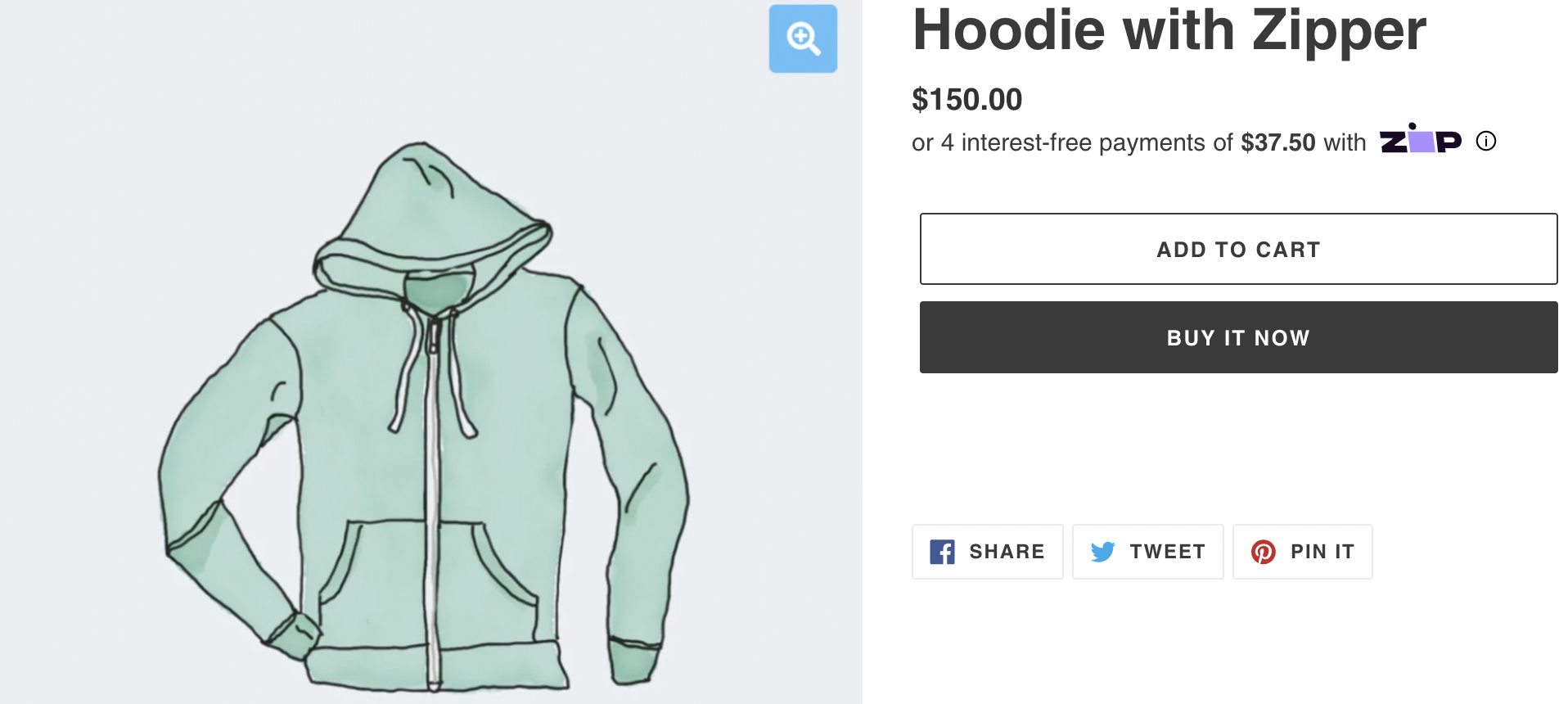
Displays the Pay-in-4amount, Zip logo, and launches Zip’s "Learn More" modal
The Zip Widget is recommended for early customer discovery as shoppers are browsing and evaluating the products they are shopping for. As customers can enter your site from different places (Google Shopping, search results, referral link from a friend, email campaign), we recommend placing the Zip widget on several potential touch points to increase awareness of Zip's buy now, pay later offering on your site. Learn more about the Zip Widget here.

Zip Payment Widget
Display the Pay-in- 4timeline, and launches Zip’s "Learn More" modal
The Zip Payment Widget takes a dynamic amount and displays it in a timeline view of 4 payments over 6 weeks. We recommend placing this widget when the customer is selecting their payment method at checkout, so that they have a visual view of how the payments will be scheduled. Learn more about the Payment Widget here.

Existing Widget IntegrationIf you are looking to adjust an existing integration, you may want to refer to our widget Customization options.
Updated 8 months ago
