
Best Practices
Best Practices
Maximize your sales funnel with strategic placement
Activating the messaging is only the first step. To truly drive conversions, boost average order value (AOV), and lower cart abandonment, you need to display it where it impacts consumer decisions most.
Following these placement and design best practices ensures your customers see the most compelling payment options at every stage of their shopping journey.
Where To Place On-Site Messaging
The most successful merchants don't wait until the checkout page to show flexible payment options. They introduce them early in the funnel to remove price friction immediately.
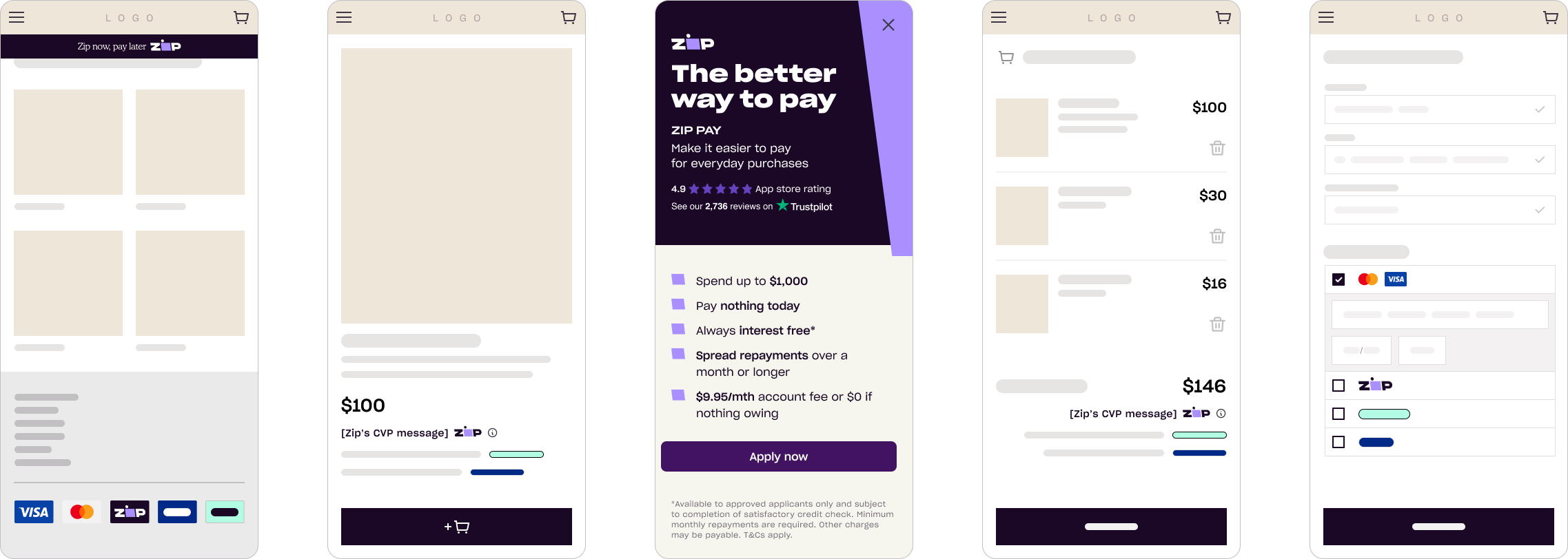
1. Product Pages (Highest Impact)
- The Strategy: Place the Smart Messaging widget directly beneath the product price.
- Why it works: It instantly reframes a large, lump-sum cost into a series of smaller, affordable installments right when the customer is deciding whether to buy.
2. Cart Page (Cart-Size Booster)
- The Strategy: Position the messaging close to the total cart value.
- Why it works: If a customer adds multiple items to their cart, the messaging dynamically updates to show a manageable repayment breakdown for the total amount, reducing cart abandonment.
3. Homepage & Footer (Trust Building)
- The Strategy: Include a subtle banner or payment icon in your site header, footer, or homepage hero.
- Why it works: It acts as a trust signal, telling cross-border shoppers (across Australia and New Zealand) that flexible payment options are available before they even start browsing.
Australian Product Page Widget Example

New Zealand Product Page Widget Example

#3 Tab title here
#3 Tab content here
Dolor sit amet
Ololo pysh pysh